MOOR
Banding, packaging, campaign and illustration for a conceptual rebrand of Rescue Remedy.
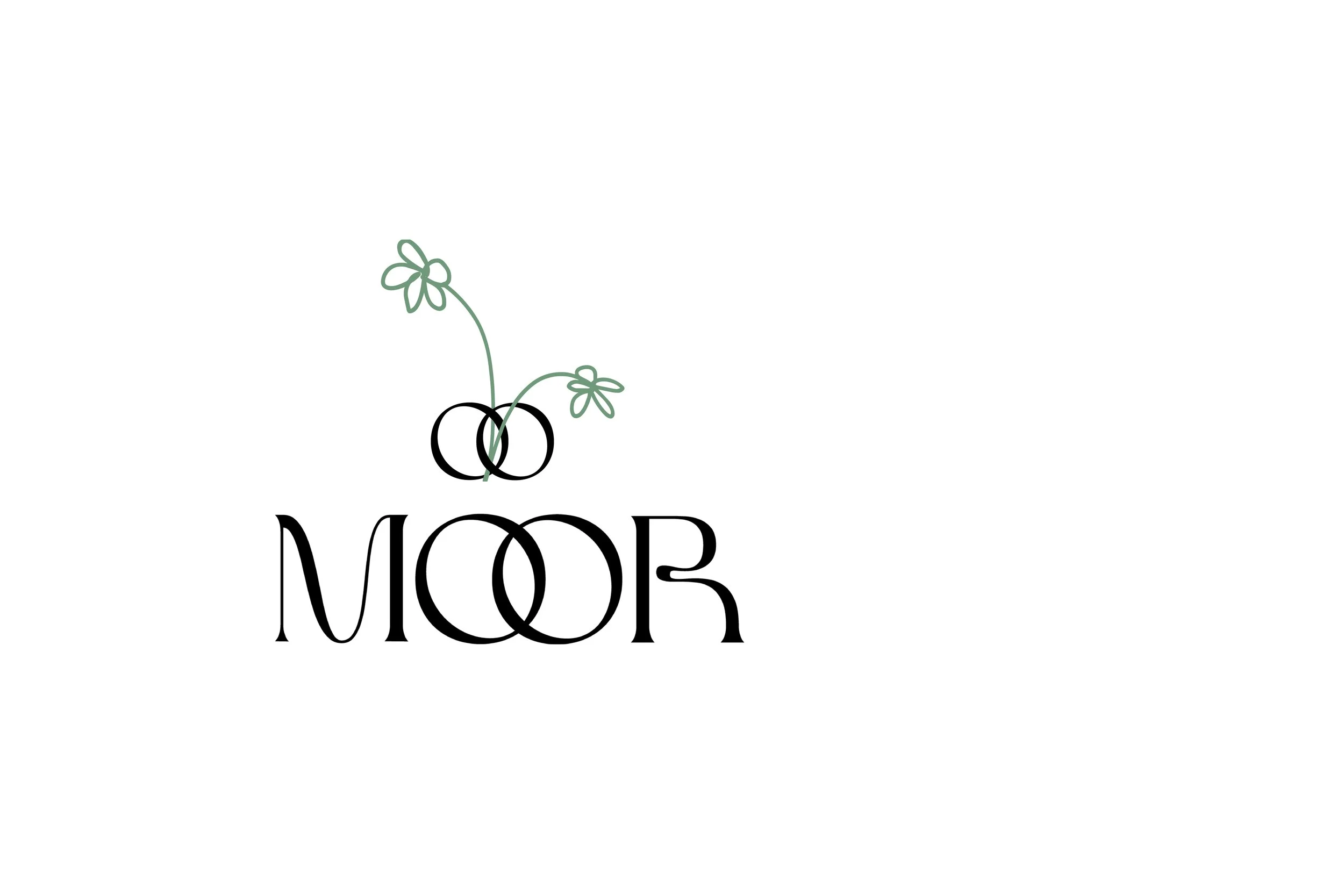
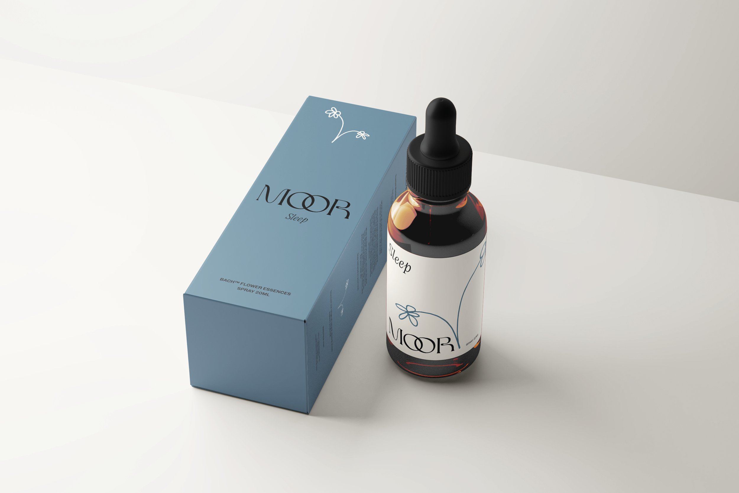
LOGO Design
The double interlocked OO represent the two states of being; the mental and the physical. They are interlocked to communicate the notion of feeling anchored - moored, even - within oneself and maintaining secure emotional well-being overall.
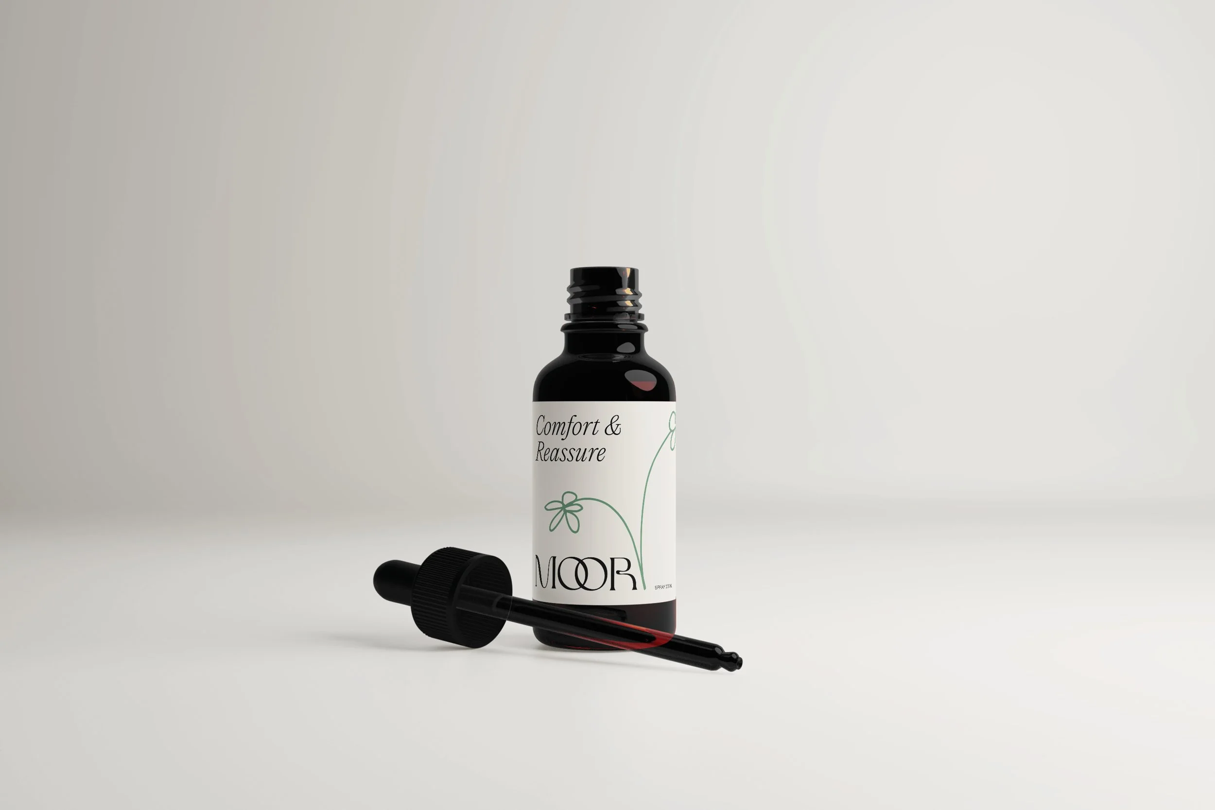
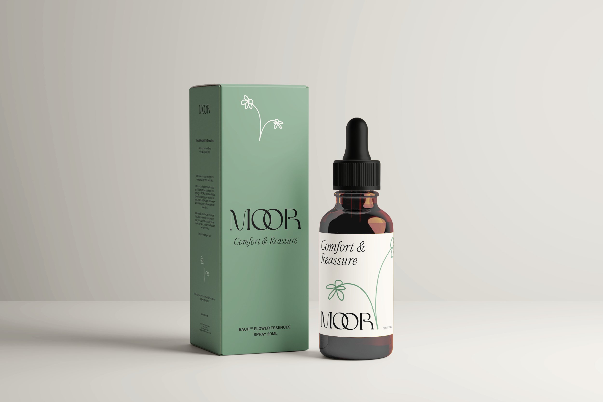
The supporting graphic is hand-drawn to reflect the organic and natural quality of the product and the brand values of compassion and well-being.
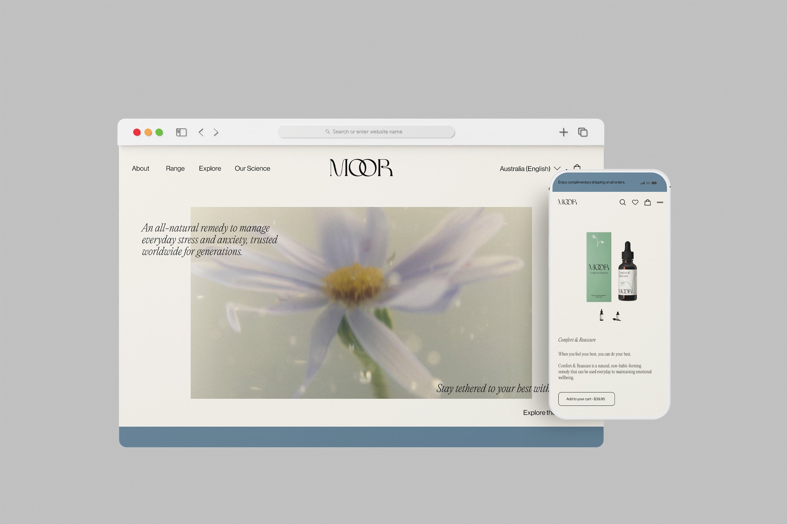
tethered to your best
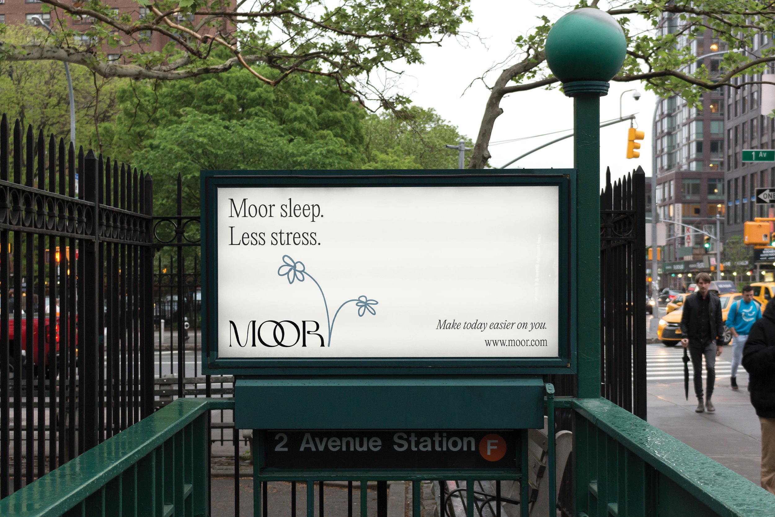
A conceptual re-brand for the product Rescue Remedy, an all-natural remedy to manage everyday stress and anxiety.
I wanted to show how the brand could be reimagined and updated to feel more contemporary, calming and aesthetically pleasing to the modern customer.
The re-branding includes two products from their dropper range, a responsive E-commerce website and an OOH campaign to highlight the opportunity to draw a new audience to the brand.
Still life by Rahel Weiss